


CSS Ribbon buttons22/9/2024
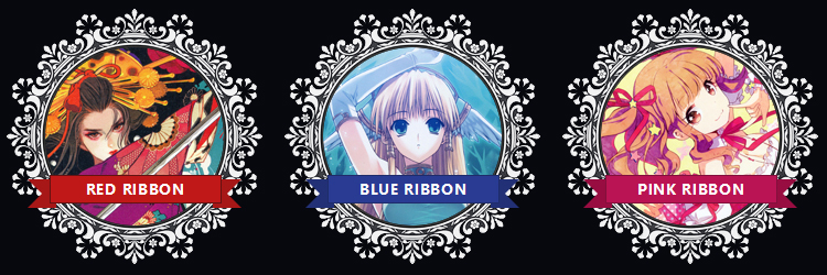
In this CSS tutorial, I will be showing you how I built these adorable ribbon buttons 🎀 for a web template with a white lace style frame for the thumbnail. When you hover your cursor over the thumbnail, the ribbon grows larger appearing as if it's lifting up off the screen.
Here's the tutorial demo to see the code in action.
HTML Structure
First we're going to start with building the structure of the thumbnail and button in HTML. You’re most likely going to have multiple thumbnails next to each other in a group. If this is the case, you’re going to need a div that contains all your thumbnails. This <div> has the “wrapper” classname and this will handle the flex layout in a later step.
Next I create a <div> for each thumbnail with a class name of “Frame”.
You may want thumbnails with different colours like I have done in the demo so this is where I have an extra modifier class such as “Frame-red” and “Frame-pink”. If all your thumbnails are going to use the same colour, ignore this step.
We want the entire thumbnail to be clickable and the animation to activate when you hover in any area of the thumbnail so the <a> hyperlink contains the image and button. This has a class name of “Frame-link”
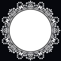
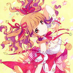
Each thumbnail has two images, the decorative frame and the photo. I made a cutout in the middle and added a background colour around the frame in order to cover the rest of the photo that will go underneath (could have done a SVG clip-path but I couldn't be bothered! 😜). Both of these images I have added a utility class of “absolute”. Make sure the frame image goes after the photo.
Last bit of the ribbon which is surprisingly very simple and the rest of the magic comes from the CSS. There is a span within a span. The wrapper span has a class name of “Frame-name” and the same utility class of “absolute”. The span inside has a class name of “Frame-text” and contains the text.


Hopefully that breakdown made sense. Here's the final result:
<div class="Wrapper">
   <div class="Frame Frame-red">
      <a href="#" class="Frame-link">
         <img src="red.jpg" class="absolute" />
         <img src="frame.png" class="absolute" />
         <span class="Frame-name absolute">
            <span class="Frame-text">Red ribbon</span>
         </span>
     </a>
   </div>
   <div class="Frame Frame-blue">
      <a href="#" class="Frame-link">
         <img src="red.jpg" class="absolute" />
         <img src="frame.png" class="absolute" />
         <span class="Frame-name absolute">
            <span class="Frame-text">Red ribbon</span>
         </span>
     </a>
   </div>
   <div class="Frame Frame-pink">
      <a href="#" class="Frame-link">
         <img src="red.jpg" class="absolute" />
         <img src="frame.png" class="absolute" />
         <span class="Frame-name absolute">
            <span class="Frame-text">Red ribbon</span>
         </span>
     </a>
   </div>
</div>
CSS magic time! ✨
Starting off with the basics. Set the body background color to the same colour you used for the background of your frame. If you just want a certain section of your page to have the same color, apply it to .Wrapper instead. For this demo, I also set the global fonts and text color too.
body {
    background-color: #07080e;
    color: #fff;
    font-family:ui-sans-serif,system-ui,-apple-
system,BlinkMacSystemFont,Segoe UI,Roboto,Helvetica Neue,Arial,Noto
Sans,sans-serif,"Apple Color Emoji","Segoe UI Emoji",Segoe UI
Symbol,"Noto Color Emoji";
}
Next the .Wrapper div that handles the layout with flex. The flex-wrap is only needed if you intend to have multiple rows of thumbnails which especially happens on smaller devices or you just have loads of thumbnails for a content feed. justify-content makes the thumbnails align to the center and the gap creates spacing in-between each thumbnail. You don't need the margin-top but you might want to create some spacing between other components on your page.
.Wrapper {
    display: flex;
    flex-wrap: wrap;
    gap: 1rem;
    justify-content: center;
    margin-top: 1.5rem;
}
For .Frame I set the width & height to be the same as the frame image. The <a> needs a relative position to contain all the absolute positioned elements inside. If you don't have this line, the images and link will be scattered to the top of the page. I want the link to spread across the entire frame so I make it display: block and width/height 100% which will inherit the same measurements of the frame wrapper div. Finally, I need to override default browser styling and change that ugly blue to white.
.Frame {
    width: 236px;
    height: 236px;
}
.Frame-link {
    position: relative;
    display: block;
    width: 100%;
    height: 100%;
    color: white;
}
Right, here we go! 🏃♀️➡️ The main event, the ribbon button! Here's the first part: For .Frame-name we need to handle the size and positioning of the button within the frame. The width will depend on the size you decide to give with in your version but I have gone with 65% of the frame size. With a position absolute element you can center it using left: 50% and translateX(-50%) then I specify where I want the button positioned vertically using top: 65%. I'm going to be animating this in a later step, using transition I can specify what I expect to change and how I want it to animate. If you want all your ribbons to the the same colour, then add the background-color and border inside .Frame-name. For the demo, I have different colours as below:
.Frame-name {
    width: 65%;
    transition: transform .25s ease;
    top: 65%;
    left: 50%;
    transform: translateX(-50%);
}

.Frame-blue .Frame-text {
    background: #293b93;
    border: 1px solid #1f2c6b;
}
.Frame-red .Frame-text {
    background: #c01818;
    border: 1px solid #641212;
}
.Frame-pink .Frame-text {
    background: #ba1453;
    border: 1px solid #83103c;
}
The .Frame-name needs :before & :after elements which will behave as the dovetails of the ribbon. before & after elements need content in order to show, this will be empty. They will be positioned absolute with a width/height of 0. I make the z-index negative in order to be positioned behind the ribbon. You can create triangular shapes using borders in CSS. I set the size of the shape with border-width and border-color controls the coordinates of the shape. Here's a great tutorial by CSS tricks on how to create shapes with CSS.
.Frame-name:before {
    content: '';
    position: absolute;
    height: 0;
    width: 0;
    border-style: solid;
    top: 4px;
    z-index: -10;
    left: -20px;
    border-width: 13px;
}
.Frame-blue .Frame-name:before {
    border-color: #223076 #223076 #223076 transparent;
}
.Frame-red .Frame-name:before {
    border-color: #a71717 #a71717 #a71717 transparent;
}
.Frame-pink .Frame-name:before {
    border-color: #980d41 #980d41 #980d41 transparent;
}
.Frame-name:after {
    content: '';
    position: absolute;
    height: 0;
    width: 0;
    border-style: solid;
    top: 4px;
    z-index: -10;
    right: -20px;
    border-width: 13px;
}
.Frame-blue .Frame-name:after {
    border-color: #223076 transparent #223076 #223076;
}
.Frame-red .Frame-name:after {
    border-color: #a71717 transparent #a71717 #a71717;
}
.Frame-pink .Frame-name:after {
    border-color: #980d41 transparent #980d41 #980d41;
}
Now the animation when hovered will increase in size by scale and the trick is to slightly shift the element upwards to give the illusion it's lifting off the screen. I need to keep the translateX -50% to still be in the center so translate3D is used.
.Frame:hover .Frame-name {
    transform: translate3D(-50%, -3px, 0) scale(1.2);
}
Whew! 😮💨 That's the complex part over and done with. Well done for getting this far, just a little bit left. 🙌 The .Frame-text span element is styling the text and setting the height of the middle of the ribbon.
.Frame-text {
    display: block;
    width: 100%;
    height: 1.5rem;
    z-index: 10;
    text-align: center;
    font-size: 0.875rem;
    font-weight: 700;
    letter-spacing: 0.05em;
    line-height: 1.4rem;
    text-transform: uppercase;
}
.Frame-blue .Frame-text {
    background: #293b93;
    border: 1px solid #1f2c6b;
}
.Frame-red .Frame-text {
    background: #c01818;
    border: 1px solid #641212;
}
.Frame-pink .Frame-text {
    background: #ba1453;
    border: 1px solid #83103c;
}
And last, but not least, our utility class of position absolute. If you're using a CSS framework like Bootstrap or Tailwind you wouldn't normally need this.
.absolute {
    position: absolute;
}
Thank you for reading my tutorial and please, please, pretty please, share your ribbon buttons in the comment section below if you followed this tutorial. I would love to see 😊